Check State Pay First: Job Outlook vs Job Growth Explained

Job outlook is the full forecast for an occupation, including the direction of demand and the reasons behind it. Job growth is one specific number inside that forecast: the projected percent change and job count over a set period, usually 10 years. Check the percent to spot momentum, but check the absolute number of openings, including replacement openings, before deciding whether a field actually has room for you.
*TL;DR:>
- High percent growth rates often reflect small starting employment bases, so evaluate the actual number of new jobs and total openings for a realistic view.*
- Large occupations with steady demand can have modest growth percentages but still add hundreds of thousands of jobs annually due to their size.
- Projections are estimates that can revise frequently, and regional data may differ significantly from national numbers, affecting job prospects locally.
- Combining growth rate, total openings, pay in your state, and training requirements is essential for accurately assessing long-term career opportunities.
- Salary data from resources like Salary Atlas helps confirm whether projected growth translates into competitive pay in your desired location before making a commitment.
Table of Contents
- Job Outlook vs Job Growth: The Core Difference
- How Are These Numbers Actually Calculated?
- How Do You Read a 6% vs a 2% Job Outlook?
- Real Occupations Where Outlook and Growth Diverge
- Where Job Outlook and Growth Data Fall Short
- How to Use Job Outlook and Growth Together
- Where Salary Atlas Fits Into the Picture
- A Personal Note on Reading the Numbers
- Check Your Occupation's Pay Before You Commit
- Sources
- FAQ
Job Outlook vs Job Growth: The Core Difference
Job outlook is the bigger picture. It's the narrative version of where an occupation is headed, built from projected demand, industry trends, automation risk, and the forces driving hiring up or down. When the Occupational Outlook Handbook describes an occupation's outlook, it's answering a broad question: is this a field with a future, and why?
Job growth is narrower and more mechanical. It's the specific percent change in employment projected over a fixed window, paired with the numeric job count that percent represents. A field can have a strong outlook (rising wages, growing subfields, low automation exposure) while posting middling growth numbers, and vice versa.
Here's the shorthand version:
- Job outlook = the story: why demand is rising, falling, or holding steady, and what's driving it.
- Job growth = the math: percent change plus the actual number of jobs added or lost.
- Job openings = a related but separate figure that includes replacement demand, not just growth.
The Employment Projections program at the Bureau of Labor Statistics is the source most career guides lean on for both. When a Salary Atlas occupation page or the Occupational Outlook Handbook says an occupation has a "bright outlook," it usually means the underlying BLS data shows growth well above the average for all occupations, not just a favorable-sounding writeup.
How Are These Numbers Actually Calculated?
The BLS Employment Projections program is the primary engine behind almost every job outlook and job growth figure you'll see repeated across career sites, including the Occupational Outlook Handbook. Economists there model expected employment changes across roughly 800 occupations, factoring in industry output forecasts, demographic shifts, and productivity trends.
Statistic to know: BLS projections typically cover a 10 year window, and the current cycle projects total employment growth alongside occupation-specific detail broken out by percent change, numeric job additions, and total job openings, according to the Employment Projections Home Page.Three metrics get published for nearly every occupation:
- Percent change, the growth rate relative to the occupation's current size.
- Numeric change, the actual count of jobs gained or lost over the window.
- Job openings, a combined figure that folds in growth-driven positions and replacement positions from retirements, career changes, and turnover.
ONET adds a fourth layer with its Bright Outlook occupations list, which flags roles projected to grow rapidly, generate large numbers of openings, or qualify as new and emerging fields. The ONET Resource Center documents how it defines "new and emerging," which matters if you're eyeing a role that didn't exist in the last projection cycle. BLS supplies the raw numbers; O*NET filters them into a shortlist worth a second look.
How Do You Read a 6% vs a 2% Job Outlook?
Percentages lie by omission if you don't ask what they're a percentage of. They rarely do.
Here's how to actually interpret the numbers:
- Find the percent change first. This tells you direction and relative momentum, nothing more.
- Find the numeric change next. This converts percent into real job counts, which is what actually matters for hiring odds.
- Add in job openings. BLS openings figures include replacement need, meaning turnover from retirement or career switching, not just newly created roles.
- Cross-check against the BLS category label. Occupations get sorted into bands like decline, little or no change, slower than average, about as fast as average, faster than average, and much faster than average, based on BLS's category system.
A solid growth rate on a smaller occupation adds a moderate number of jobs. A modest growth rate on a large occupation can add many jobs nationally. The smaller field posts the flashier headline; the larger one delivers 30 times the actual hiring volume. Analysts specifically warn against reading percent growth on a small base as equivalent to percent growth on a large one, since the distributional differences between the two can completely reverse which field offers more real opportunity. Pro Tip: Never screen an occupation on percent growth alone. Pull the numeric job count and the total job openings figure in the same sitting, then judge them together.
Real Occupations Where Outlook and Growth Diverge
Numbers get abstract fast, so here's what the percent-versus-count gap looks like with actual occupations.
- Wind turbine service technicians post some of the highest percent growth rates the BLS tracks, often well into double digits, because the occupation started from a tiny employment base. That headline percentage is real, but the total number of new positions nationally stays modest in absolute terms since there simply aren't that many workers in the field yet.
- Registered nurses post a percent growth rate far lower than turbine technicians, often closer to single digits, but the occupation already employs millions of people. That modest percentage translates into one of the largest numeric job gains of any occupation the BLS tracks, plus enormous replacement demand from an aging workforce moving toward retirement.
- Occupations flagged as "decline" or "little change" can still post real hiring activity. A field can register close to flat growth on paper while advertising tens of thousands of annual openings, purely from turnover. If you only checked the growth label, you'd walk right past a field that's actively hiring.
The lesson isn't that small-base fields are bad bets. Wind and solar-adjacent trades genuinely offer strong career upside, especially early in an emerging industry. The lesson is that the percent alone tells you almost nothing about how many actual interviews you'll be competing for.
Where Job Outlook and Growth Data Fall Short
Every projection is an estimate, not a guarantee, and treating a 10-year forecast as gospel is the fastest way to misread the labor market.
- Revisions happen constantly. Government economic reports get restated as new data comes in, and short-term payroll numbers can swing month to month for reasons that have nothing to do with an occupation's long-term trajectory. Economic commentary on recent payroll reports has repeatedly flagged how sector-specific revisions can distort a single month's headline number, which is exactly why trend averages matter more than any one print.
- National numbers hide regional reality. A field might show flat national growth while booming in Texas or the Pacific Northwest because of where employers are actually clustering. Always check state-level demand before ruling an occupation out based on the national figure alone.
- Automation and AI move faster than the projection cycle. BLS projections get built on current technology adoption trends, but a new tool or workflow shift can change hiring needs inside of two or three years, well before the next projection update lands.
None of this makes the data useless. It just means a projection is a strong starting signal, not a final verdict.
How to Use Job Outlook and Growth Together
Treat this as a four-step screening process, not a single lookup.
- Screen with percent growth and total openings side by side. A field needs both a decent growth rate and a meaningful volume of openings to clear the first filter. If either number looks weak on its own, dig into why before moving on.
- Confirm median pay and regional demand. National growth numbers say nothing about what you'll actually earn in your state. Cross-reference the occupation against state-level salary data to see whether pay and demand line up where you actually live or plan to relocate.
- Check training time and credential requirements. A field with excellent growth numbers isn't much use if it requires a four-year degree you're not positioned to pursue. Weigh the time-to-credential against how fast the field is projected to tighten or loosen.
- Decide your next move based on the combined signal. Strong growth plus strong pay plus manageable training time means act now: apply, enroll, or start networking in that field. Weak signals on two of three axes mean it's worth exploring, but not betting your next five years on exclusively.
Pro Tip: Run this same four-step check against your current occupation once a year, not just when you're job hunting. Outlook data shifts, and a field that looked flat two years ago can move into "faster than average" territory without much public attention.
If you're still narrowing down a field entirely, aligning your training path to where the demand actually sits matters more than picking a major that sounds impressive. Guides like how to choose the right college major can help you match coursework to occupations that show up favorably on both outlook and growth.
Where Salary Atlas Fits Into the Picture
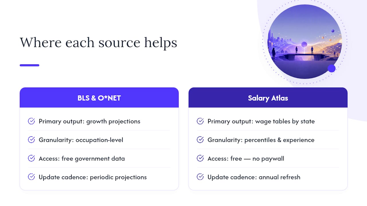
BLS and O*NET tell you whether an occupation is growing. They don't tell you what that growth is actually worth in your state. Salary Atlas fills that gap with wage tables sourced directly from BLS data, refreshed annually, broken out by state, percentile, and experience level, with no paywall between you and the number.
A quick example: an occupation projected for solid growth nationally might pay well above the national median in one state and noticeably less in another. Pairing the Data Analyst Salary page with its BLS-sourced growth projection gives you both halves of the decision in one look, instead of jumping between three different government sites. The Salary Atlas methodology page walks through exactly how those figures get matched back to their original BLS source.
A Personal Note on Reading the Numbers
Data should narrow your options, not make the decision for you. If two fields both clear the bar on growth, pay, and training time, the tiebreaker is usually fit, not another spreadsheet. Build in a hedge anyway: transferable skills, a part-time trial run, or one upskilling credential that keeps a second door open.
— Joelen Zyoktova
Check Your Occupation's Pay Before You Commit
A strong job outlook means little if the pay doesn't hold up where you actually live, and that's the piece most projection tools leave out entirely. Salary data is often available linking back to BLS sources and covering state-by-state variation, with efforts made to keep the data refreshed annually rather than stale.
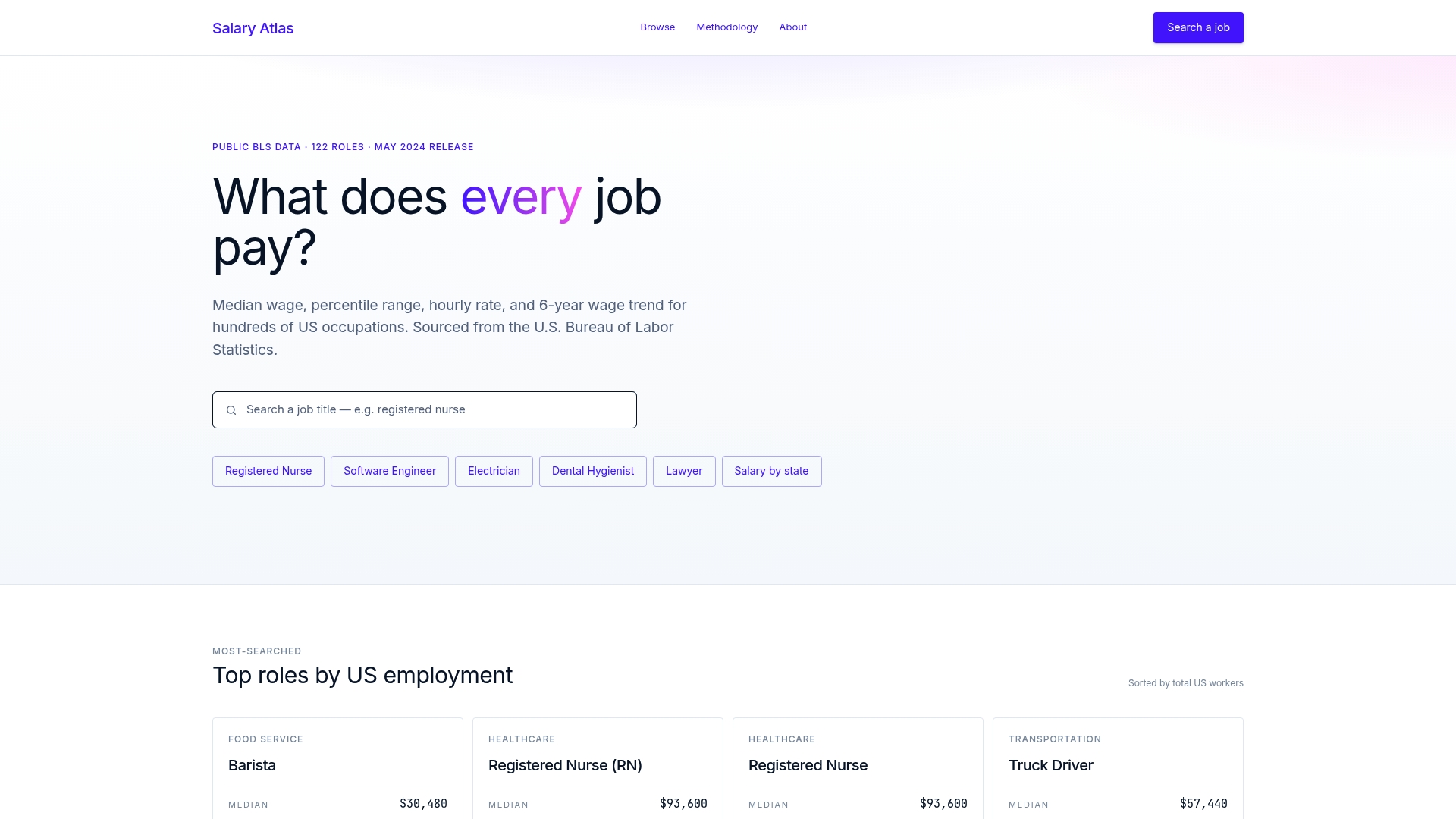
Search any occupation on Salary Atlas to pull median pay, percentile ranges, and state comparisons in one pass, no signup required. If you're weighing a shift into a specific field, start with the state salary comparison tool to confirm the numbers hold up in your region before you commit time or tuition to it. Pairing that wage data with tools from a resource like the 2026 career tech stack guide rounds out your research before you make a move.
Sources
FAQ
What Is the Job Outlook for the Next 10 Years?
BLS projections are structured around a 10-year window and vary enormously by occupation, ranging from projected decline in some fields to double-digit growth in others like renewable energy trades and healthcare support roles. Check the Occupational Outlook Handbook for the specific occupation you're considering rather than relying on an economy-wide average.
Why Is It So Hard to Get a Job Right Now?
Hiring difficulty often comes down to a mismatch between where growth is concentrated and where job seekers are applying, plus short-term payroll volatility that can make the market feel weaker than the 10-year outlook suggests. Checking both the long-term projection and current state-level demand through resources like Salary Atlas gives a clearer read than a single month's headline numbers.