2.8% COLA Won't Close the U.S. Wages vs Cost of Living Gap
The 2.8% COLA for 2026 won't equalize wages across U.S. metros. Learn an after tax cost of living method using BLS data on Salary Atlas.
By the Salary Atlas editorial team · Published

For most workers in high-cost states, pay raises are not keeping pace with what things actually cost, even with the Social Security Administration's 2.8% COLA for 2026 now in effect. The gap is not universal, but it's wide enough in places like California and Massachusetts to erase a "good raise" within a year. If you want a real answer for your own situation, run a cost-of-living-adjusted comparison using a tool like Salary Atlas before you accept a number at face value.
TL;DR:
- Wage growth often falls short of the 2.8% Social Security COLA in high-cost states, erasing any real benefit for many workers within a year.
- Comparing salaries across cities requires converting gross pay to after-tax income and adjusting for local cost-of-living indexes, which often reveal a different financial reality.
- Housing costs account for 30% to 40% of regional living expenses and are the primary driver of the pay gap between high- and low-cost cities.
- Local taxes, healthcare, transportation, and childcare can significantly influence the true affordability of a salary, especially for households with dependents.
- A genuine livable wage varies widely by location and household needs, often surpassing federal or median wages and making single numbers misleading for budgeting.
Table of Contents
- Cost of Living vs Wages: The National Picture for 2026
- How to Compare Your Salary to Local Cost of Living
- Why Housing Drives Most of the Regional Gap
- What Actually Counts as a Livable Wage
- What to Do With This Information
- Sector-Specific Wage vs. Cost of Living Disparities
- Cost of Living, Wages, and the Widening Inequality Gap
- What These Numbers Actually Mean for You
- Run Your Own Numbers With Salary Atlas
- Sources
- FAQ
Cost of Living vs Wages: The National Picture for 2026
The 2.8% Social Security COLA for 2026 gives you a useful benchmark, but it's a blunt one. It applies to roughly 71 million beneficiaries and about 7.5 million SSI recipients, and it's calculated from the CPI-W, a specific inflation measure the SSA explains in its COLA methodology notes. Wage earners don't get an automatic COLA the way Social Security recipients do. Raises come from employer budgets, labor market pressure, and negotiation, which means your actual pay bump this year could be well above or below 2.8%.
The deeper problem is structural, not just seasonal. Wage growth has lagged behind productivity growth for decades, a pattern the Economic Policy Institute has tracked across multiple economic cycles. Workers are producing more value per hour than 40 years ago, but pay hasn't scaled with that output. That gap doesn't close in a single COLA cycle.
National averages also flatten out a lot of local pain.
Statistic Callout: A national "average wage growth" figure can look healthy while renters in Miami, Denver, or Boston lose ground every month, because the average blends together a housing market gaining 2% a year with one gaining 9%.A few things to keep in mind when you read a headline wage statistic:
- National wage growth numbers are averages, not a promise about your metro area.
- The 2.8% COLA applies to Social Security and SSI, not private-sector raises.
- Inflation measured by CPI-W does not track housing costs the same way local rent data does.
How to Compare Your Salary to Local Cost of Living
Comparing a $75,000 offer in Austin to a $95,000 offer in San Francisco isn't a matter of subtraction; understanding this requires using a reliable college cost calculator methodology to navigate multi-component cost comparisons. You need a consistent method, or you'll end up comparing numbers that were built on different assumptions entirely.
- Pick one cost-of-living source and stick with it. Cost-of-living indexes vary by methodology, so mixing sources (one city's number from Numbeo, another from a county assessor) produces a comparison that means nothing, a pitfall Forbes Advisor's cost-of-living tool flags directly.
- Convert both salaries to after-tax income. State income tax alone can swing take-home pay by 5 to 10 percentage points between states like Texas and California.
- Apply the cost-of-living index to the after-tax number, not the gross salary. This is where most DIY comparisons go wrong.
- Check the result against a livable-wage benchmark, such as the MIT Living Wage Calculator, which breaks down local estimates by county and household type.
Why Housing Drives Most of the Regional Gap
Housing is the single biggest reason a $70,000 salary feels comfortable in Tulsa and tight in Seattle. It's not a small factor buried among many; it typically accounts for 30% to 40% of the total cost-of-living variation between American cities. A raise that looks identical on two offer letters can mean two completely different financial realities once you factor in rent or a mortgage payment.
Housing isn't the only driver, though it's usually the largest one. Other costs shift the picture depending on your household:
- State and local taxes can eat 0% to over 13% of income depending on where you live, with no federal offset for high-tax states.
- Healthcare premiums vary sharply by region and employer, and self-purchased plans in some states cost double what they do in others.
- Transportation costs more in car-dependent metros without transit alternatives, even before factoring in gas price swings.
- Childcare can run $1,000 to $2,500 a month in expensive metros, sometimes rivaling a mortgage payment.
What Actually Counts as a Livable Wage
"Livable wage" gets thrown around loosely, but it means something specific and it changes by location. The federal minimum wage, a state's median wage, and a living-wage calculator's output are three different numbers answering three different questions, and confusing them leads to bad conclusions.
- Minimum wage is a legal floor, not an affordability benchmark. It hasn't been designed to track cost-of-living changes in most states.
- Median wage tells you what a typical worker in that metro earns, useful for comparison but not a target for adequacy.
- Living-wage calculator output, like the MIT Living Wage Calculator, estimates what's actually needed to cover food, housing, healthcare, and transportation for a specific household size in that county.
What to Do With This Information
Data is only useful if it changes a decision. Here's how to put it to work.
- Run a cost-of-living-adjusted comparison for any offer or raise using consistent, after-tax numbers, not headline salary.
- Document your total compensation, including healthcare, retirement match, and PTO, since benefits can swing the real value of an offer by thousands of dollars a year.
- Bring local wage data to a negotiation. A wage-versus-salary breakdown helps you frame the ask in terms your manager can act on, not just a vague request for "more."
- Weigh relocation against remote work carefully. Moving to a cheaper metro helps only if your salary doesn't drop proportionally; staying remote in a high-cost area can offset commuting costs but won't fix a rent problem.
Sector-Specific Wage vs. Cost of Living Disparities
Not every industry absorbs cost-of-living pressure the same way. Tech and finance workers in expensive metros often earn enough of a premium to offset local costs, because employers in those sectors compete nationally for talent and adjust pay bands accordingly. Healthcare and education workers usually don't get that same premium, even though they're just as exposed to local rent and grocery prices.
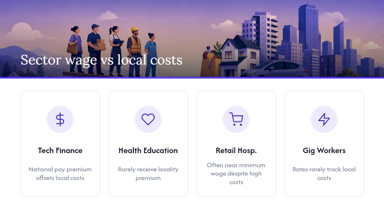
Retail, hospitality, and food service workers face the sharpest mismatch. These jobs frequently pay close to minimum wage regardless of metro, while the cost of living in the cities where these jobs concentrate (major tourist and urban centers) runs well above the national average. A barista in San Diego and a barista in Wichita may earn nearly identical hourly wages, but their actual purchasing power is nowhere close.
Government and unionized public-sector jobs sometimes include locality pay adjustments that private-sector employers don't offer at all, which partially explains why public-sector pay can look more competitive in high-cost cities than equivalent private roles. Freelancers and gig workers have the least protection here. They set their own rates, but few adjust those rates in step with local cost changes, and platform-based gig work often pays the same national rate no matter where the worker lives.
If you're evaluating an offer, check how your specific occupation and sector pays across regions using a state-level wage tool rather than assuming your industry follows the same regional pay logic as tech or finance.
Cost of Living, Wages, and the Widening Inequality Gap
The wage-versus-cost-of-living gap doesn't distribute evenly across income levels, and that's where it starts affecting social mobility rather than just monthly budgets. Higher earners in expensive metros can absorb cost-of-living pressure because their income leaves room after essentials. Lower and middle earners in the same metro often can't, which means the same rent increase that's an inconvenience for one household is a crisis for another.

This connects directly to the productivity-pay gap. When wages fail to track productivity growth over decades, the gains get captured elsewhere, typically by capital owners and higher earners, rather than passed down through broad wage increases. That compounding effect makes it harder for a worker starting at the bottom of the wage scale to climb, because the rungs of the ladder (housing costs, education costs, healthcare costs) are rising faster than entry-level and mid-level wages.
Geographic inequality adds another layer. Workers born into high-cost, high-opportunity metros often have access to better-paying jobs but also face steeper costs to establish a foothold there, like a security deposit or a down payment. Workers in lower-cost regions face the opposite problem: affordable housing but fewer high-paying job opportunities. Moving to chase pay often means trading one constraint for another, and that trade-off falls hardest on workers without savings to cushion a relocation.
What These Numbers Actually Mean for You
Averages hide the truth: a "good" national wage number can mask a genuine affordability crisis in your specific zip code. The workers who come out ahead aren't the ones earning the highest nominal salary, they're the ones making decisions with cost-of-living-adjusted numbers instead of headline pay. Salary Atlas exists precisely because that kind of clear-eyed comparison requires transparent, BLS-sourced data, not guesswork.
, Joelen Zyoktova
Run Your Own Numbers With Salary Atlas
Salary Atlas is the resource for pulling actual BLS OEWS wage data by job title, state, and experience level, without hitting a paywall or a signup wall first.
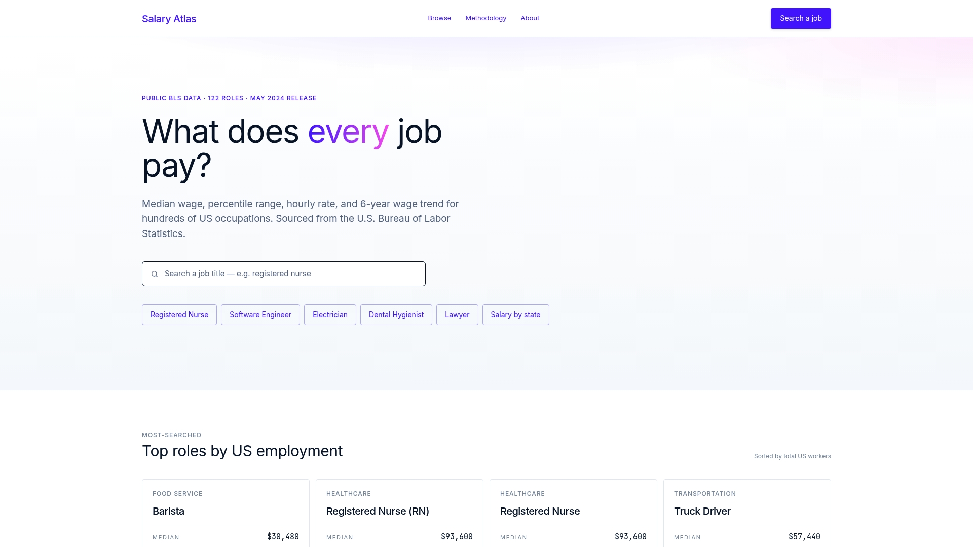
Every figure links back to its original Bureau of Labor Statistics source, so when you're building the cost-of-living-adjusted comparison described earlier, you're working from verified numbers instead of an aggregator's estimate. Start by pulling your occupation's median wage by state to establish your baseline, then run that number against a living-wage calculator for your target metro. If you want to see exactly how the data is sourced and refreshed, the Salary Atlas methodology page breaks down the process. Head to Salary Atlas to look up your role and start building a comparison that actually reflects your situation.
This article is general information, not a substitute for advice from a qualified financial advisor. Consult a qualified financial professional about your own circumstances before acting on anything here.
Sources
- Cost-of-Living Adjustment (COLA) Information | News | SSA
- Living Wage calculator
- Here’s the salary it takes to live comfortably in each U.S. state in 2026 | SmartAsset
- Productivity–pay gap analysis | Economic Policy Institute
FAQ
What percentage of Americans make over $75,000?
The exact share shifts year to year and varies significantly by state and metro, so check current state-level wage data for your specific area rather than relying on a single national figure.
Is $40,000 a livable wage?
It depends heavily on location and household size. In a low-cost rural county, a modest income can cover essentials comfortably; in most major metros, it falls short of what the MIT Living Wage Calculator estimates for even a single adult with no dependents.
Is $2,000 a month a livable wage?
For a single adult in a low-cost area, a monthly income that covers basic needs can be achieved, but it falls well below living-wage estimates in most metro areas once rent and healthcare are factored in.
Is $20 an hour a livable wage?
At full-time hours, an hourly wage that covers essentials in many lower-cost regions typically falls short of local living-wage benchmarks in expensive metros like San Francisco or New York.
Recommended
Occupation wage figures on Salary Atlas come from the U.S. Bureau of Labor Statistics. Figures in this article that are not linked to a source are estimates. See our methodology.