75th Percentile Salary: 4 Steps to Negotiate Using BLS Linked Data
Understand the 75th percentile salary, verify it in BLS tables, and use a 4 step negotiation checklist with source links.
By the Salary Atlas editorial team · Published

The Bureau of Labor Statistics publishes this figure for most occupations, and sites like Salary Atlas link every number back to that source. If your job hunting or setting pay ranges, treat P75 as a strong, but not extreme, target above the middle of the market.
TL;DR:
- The 75th percentile salary reflects market positioning and varies widely depending on occupation, region, and hours worked, not on skill or merit.
- To accurately benchmark or negotiate, always use source-verified data from the Bureau of Labor Statistics or a trusted provider like Salary Atlas, matching job title, location, and experience.
- Large differences between the 25th and 75th percentiles indicate significant pay variability within an occupation, often influenced by regional or employer-specific factors.
- Employers target the 75th percentile to attract top talent, while candidates should treat it as a ceiling rather than a standard pay level.
- The calculation involves interpolation within sorted salary data, and online sources link directly to original tables for precise, up-to-date figures.
Table of Contents
- What Does 75th Percentile Mean in Salary Data?
- How Do You Calculate a 75th Percentile Salary?
- What Do Typical 75th Percentile Salaries Look Like?
- Why Does the 75th Percentile Matter for Pay Strategy?
- Where Do 75th Percentile Salary Figures Come From?
- How Do You Use the 75th Percentile in a Salary Negotiation?
- What Salary Atlas Gets Right About Percentile Data
- Find Your Role's 75th Percentile on Salary Atlas
- Sources
- FAQ
What Does 75th Percentile Mean in Salary Data?
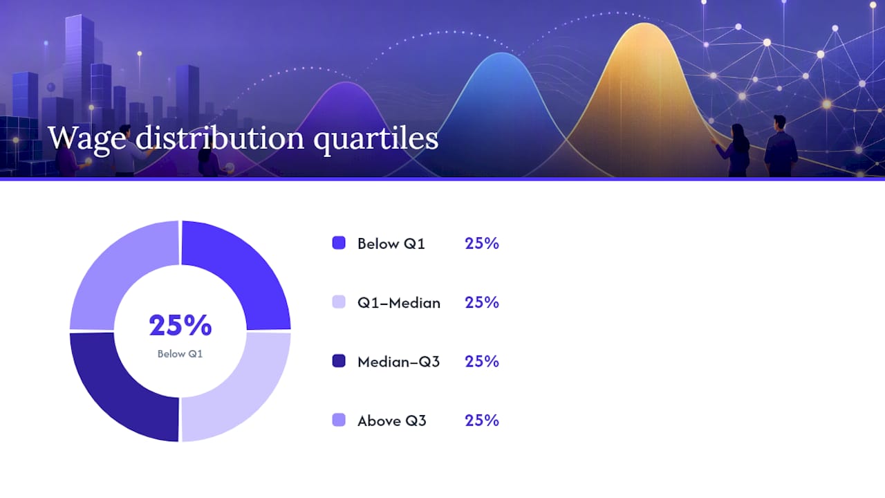
The 75th percentile is the third quartile of a wage distribution, the point at which three quarters of workers fall below and one quarter fall above. Statisticians sometimes shorten it to Q3, and it sits alongside the 25th percentile (Q1) and the 50th percentile, or median, as the three markers that describe how pay spreads out across a workforce.
People often confuse "percentile" with "percentile rank," but the two answer different questions. A percentile is a value on the pay scale, like $95,000. A percentile rank tells you where a specific salary sits relative to everyone else, like "this salary ranks at the 80th percentile." One is a dollar figure; the other is a position.
A few things the 75th percentile does not mean:
- It is not the "top" salary or anything close to it. A quarter of the workforce still earns more.
- It says nothing about skill or performance. It reflects market position, not merit.
- It is relative to a specific occupation, region, or dataset, not a universal dollar amount.
How Do You Calculate a 75th Percentile Salary?
For small datasets, statisticians commonly use the position formula Pk = k(n+1)/100, where k is the percentile you want and n is the number of data points. When that position lands between two values, you interpolate.
Here's a worked example with nine salaries, sorted low to high: $45,000, $48,000, $52,000, $55,000, $58,000, $61,000, $65,000, $70,000, $78,000.
- Plug in the numbers: position = 75(9+1)/100 = 7.5.
- That's halfway between the 7th and 8th values in the sorted list: $65,000 and $70,000.
- Interpolate: $65,000 + 0.5 × ($70,000 to $65,000) = a calculated value approximately midway between $65,000 and $70,000.
What Do Typical 75th Percentile Salaries Look Like?
The dollar figure for P75 swings widely depending on occupation, location, and how many hours people actually work. A part-time-heavy field will show a lower 75th percentile than one where full-time, salaried roles dominate, even if the underlying skill level is similar.
A few patterns worth knowing:
- Technical and licensed occupations, like network engineering, tend to show a wider gap between the 25th and 75th percentile than roles with standardized pay scales.
- Education roles, such as high school teachers, often show a narrower spread because union contracts and step scales compress the range.
- Roles with long tenure ladders, like college professors, can show a 75th percentile that's dramatically higher than the median because senior faculty pull the upper end up.
Why Does the 75th Percentile Matter for Pay Strategy?
Employers use the 75th percentile when they need to win a competitive hiring market, not just meet it. Paying at the median keeps you in the game; paying at P75 signals you're actively trying to out-recruit rivals for scarce talent.
For employees, the 75th percentile works as a negotiation anchor and a career-planning marker. It tells you what "doing well" looks like in dollar terms for your specific role, without pretending you need to hit the top of the range to be paid fairly.
The trade-offs run in both directions:
- Employers who set pay at P75 across the board face real budget pressure and risk internal equity problems if raises aren't applied consistently.
- Candidates who anchor every negotiation to P75 without adjusting for their actual experience level can price themselves out of otherwise strong offers.
- Both sides benefit from treating P75 as a strategic ceiling for competitive roles, not a floor for every position.
Where Do 75th Percentile Salary Figures Come From?
The most reliable starting point is the Bureau of Labor Statistics, specifically its Occupational Employment and Wage Statistics program, which publishes percentile wage data for most tracked occupations directly from employer surveys. That's the primary source behind nearly every credible salary percentile you'll see cited online.
Not all published figures agree, and that's not necessarily a red flag. Different aggregators define job titles differently, pull from different sample sizes, and update on different schedules, which is exactly why the same job title can show a $10,000 spread across two sites. Salary Atlas addresses this by linking every percentile figure back to its original OEWS table, so you can verify the number rather than take it on faith.
To pull and cite a 75th-percentile figure yourself:
- Search the occupation on the BLS OEWS database or a site that mirrors it with sourcing intact.
- Confirm the geographic level (national, state, or metro) matches what you need.
- Note the data year, since OEWS figures refresh annually and older numbers understate current pay.
How Do You Use the 75th Percentile in a Salary Negotiation?
Walking into a negotiation with a single number rarely works as well as walking in with the full percentile picture. Here's how to build that case:
- Pull the 25th, 50th, and 75th percentile figures for your exact title, location, and experience band.
- Adjust for total compensation, not just base pay. If a competing offer includes strong benefits, factor that into where you actually sit.
- Frame your ask around the range, not just the top number: "Based on published BLS data, the 75th percentile for this role in this market is $X. Given my experience, I think that's a fair target."
- If the employer can't meet P75 in base pay, ask about a sign-on bonus, an accelerated six-month review, or added vacation time as a bridge.
What Salary Atlas Gets Right About Percentile Data
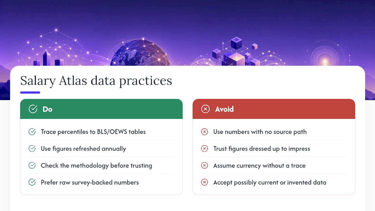
Every percentile figure in this piece traces back to a table you can check yourself, which is the whole point. Too many salary sites publish a number with no path back to its source, and readers have no way to know if it's current or invented.
Salary Atlas was built around that gap: pull directly from BLS and OEWS data, refresh it annually, and never dress up a figure to look more impressive than the underlying survey supports. If you're using a 75th percentile number to negotiate a raise or set a hiring range, check the methodology behind it before you trust it.
, Joelen Zyoktova
Find Your Role's 75th Percentile on Salary Atlas
Knowing the formula behind P75 is one thing. Getting the actual dollar figure for your job title, in your state, can be challenging on many salary sites that limit access behind paywalls or signup forms.
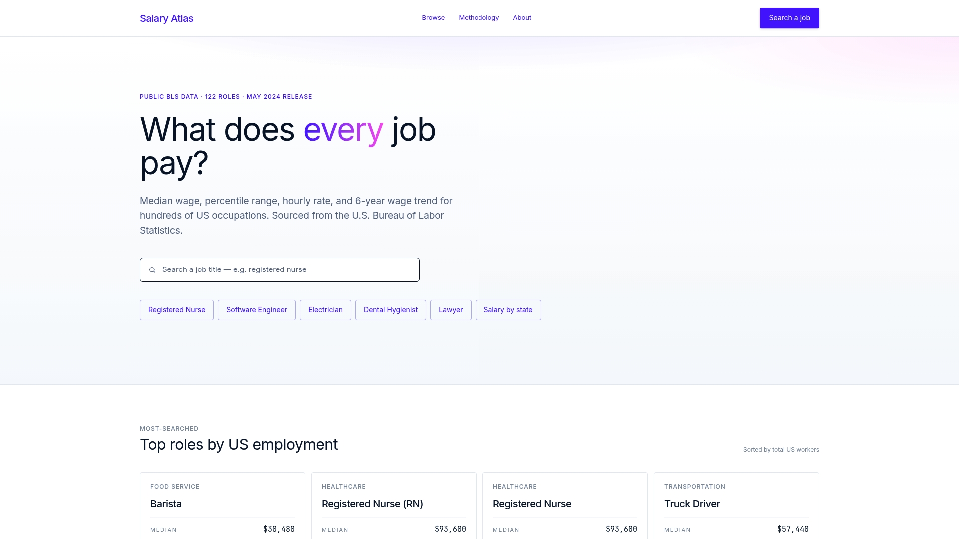
Salary Atlas solves that by publishing full percentile breakdowns, 25th through 90th, for hundreds of occupations, each one linked straight to its BLS or OEWS source table. You can check a data analyst's salary range, compare pay across states on the salary-by-state page, or look up an occupational therapist's pay range before you walk into your next negotiation. Start at Salary-atlas and search your job title to see exactly where the 75th percentile lands for your role right now.
Sources
Check figures directly against the BLS OEWS program for occupation-level percentile wages, review Salary Atlas's methodology for sourcing details, and see Math is Fun's percentile guide for additional worked calculation examples.
- Percentile | Definition, Quartile, & Facts | Britannica
- 75th Percentile in Intro to Statistics | Fiveable
- Percentiles, Percentile Rank & Percentile Range: Definition & Examples
FAQ
What percentile is a $200,000 salary?
It depends entirely on the occupation and location. In many technical or specialized fields, $200,000 is an amount that varies depending on the occupation and location, with technical or specialized fields showing different percentile placements, while in high-paying professions like medicine or law, it can sit closer to the median.
What percentage of Americans make over $75,000 a year?
This varies by year and data source, and the exact current share isn't something to state without pulling the latest BLS or Census figures directly, since income distributions shift annually with inflation and wage growth.
What percentile is a salary of $300,000?
For the vast majority of occupations tracked by BLS, $300,000 is a high salary amount that generally exceeds typical published percentile figures for most occupations, often well above it, though a handful of executive and specialist roles report percentile bands that high as standard practice.
What percentile is a $250,000 salary?
Similar to $300,000, a $250,000 salary is a figure that varies widely by occupation and region, often exceeding typical percentile benchmarks but differing in specific cases for most occupations, with exceptions concentrated in medicine, senior corporate leadership, and select finance roles.
What is the difference between the 25th and 75th percentile salary?
The 25th percentile marks where a quarter of workers earn less, while the 75th percentile marks where three quarters earn less. The gap between the two, the interquartile range, shows how much pay varies within that occupation.
Recommended
Occupation wage figures on Salary Atlas come from the U.S. Bureau of Labor Statistics. Figures in this article that are not linked to a source are estimates. See our methodology.